PROJECTS
Larger scale design exercises

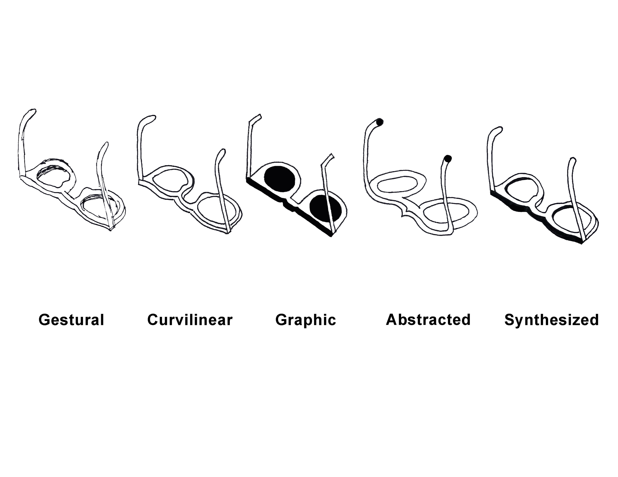
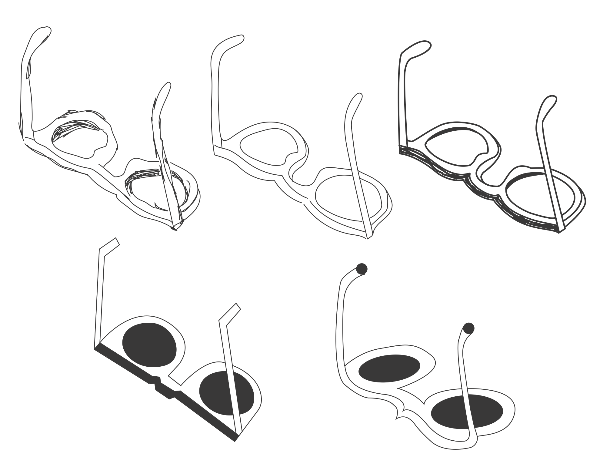


Ocularia Logo Development
I was tasked to create a logo for a business based on an object, any object. I wanted to use something that I didn’t focus on often and had a lot of interesting angle possibilities. As a non-glasses-wearer, this object had novelty to me with moveable parts for variation. I found that ocularia in latin translates to glasses, and I was hooked. I drew 50 sketches, created translations of my favorite, and chose from 25 font combinations to end up with two final variations of Ocularia Optical’s logo.
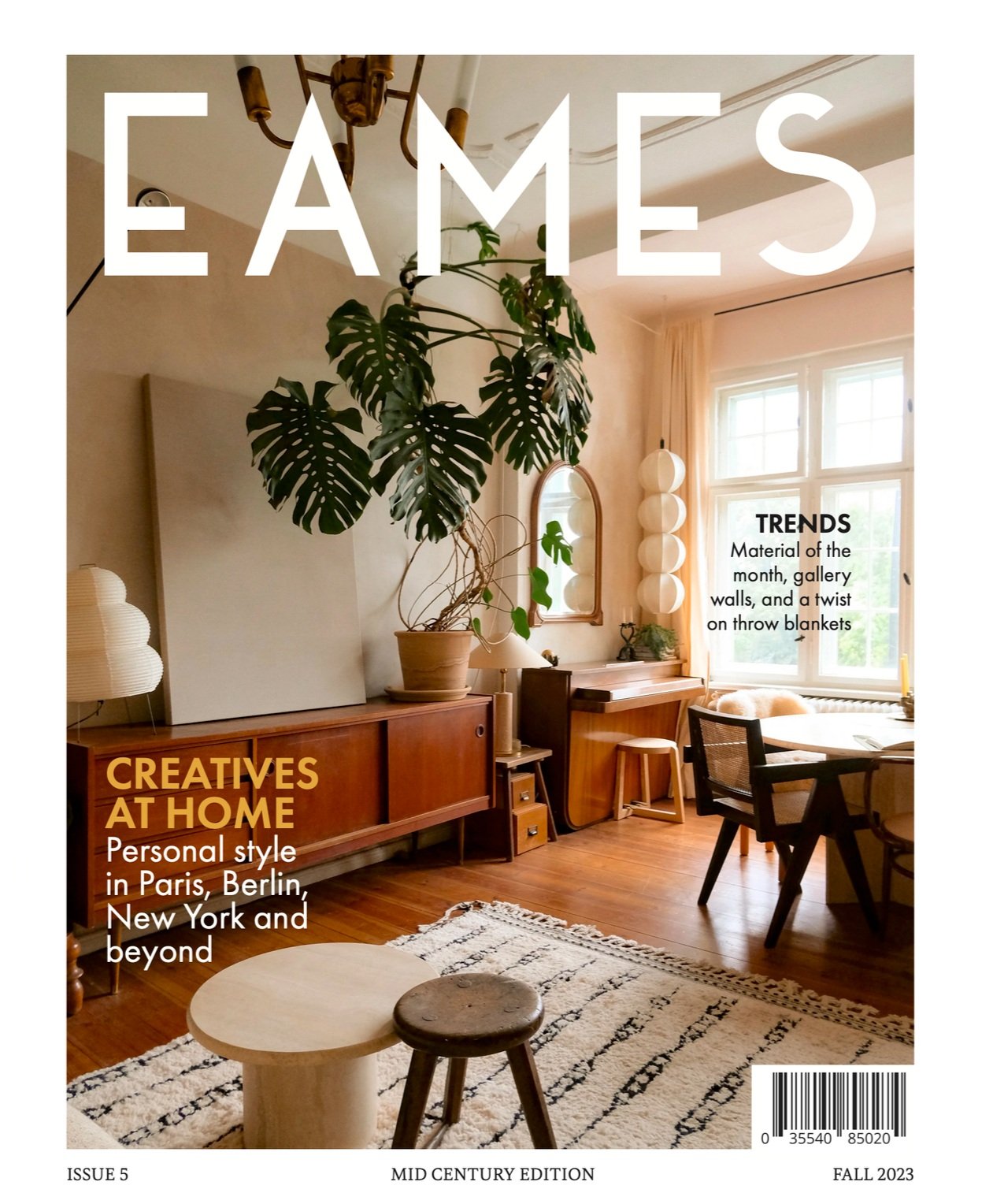


EAMES Magazine
Motivated by my long-standing love of Mid Century Modern design and my mother’s omnipresent coffee table arrangement of Dwell, I created my very own design magazine. Eames of course came from the iconic chair, designed by its namesake husband and wife Charles and Ray Eames. I wanted a mix of classical MCM elements with a youthfulness and simplicity. Futura as one of my main typefaces was a must. I knew I wanted running shoulders as a pop of color and a natural attention point as the reader flips through with their thumb placement. The magazine was printed in full, all 44 pages, and now sits proudly on my shelf.

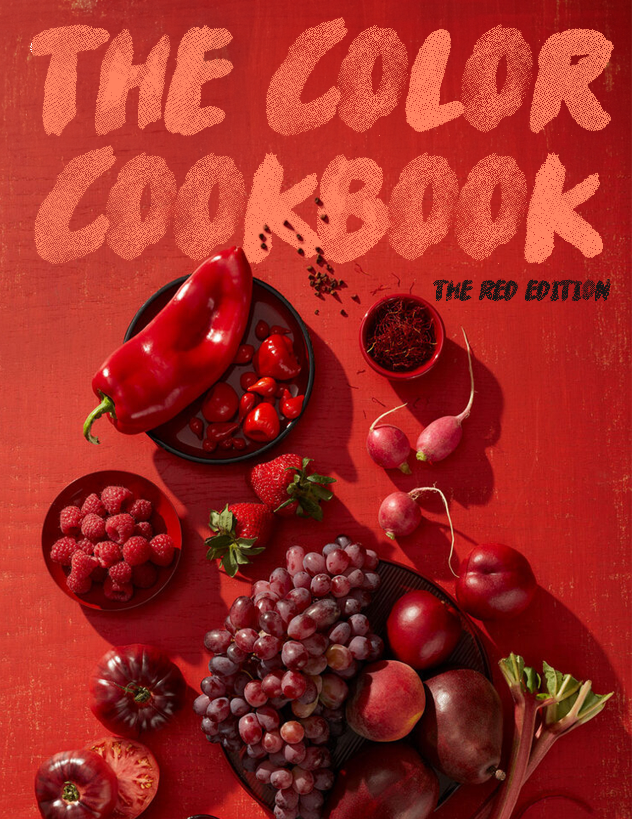

The Color Cookbook
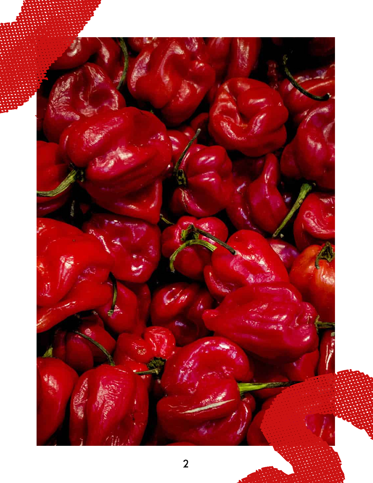
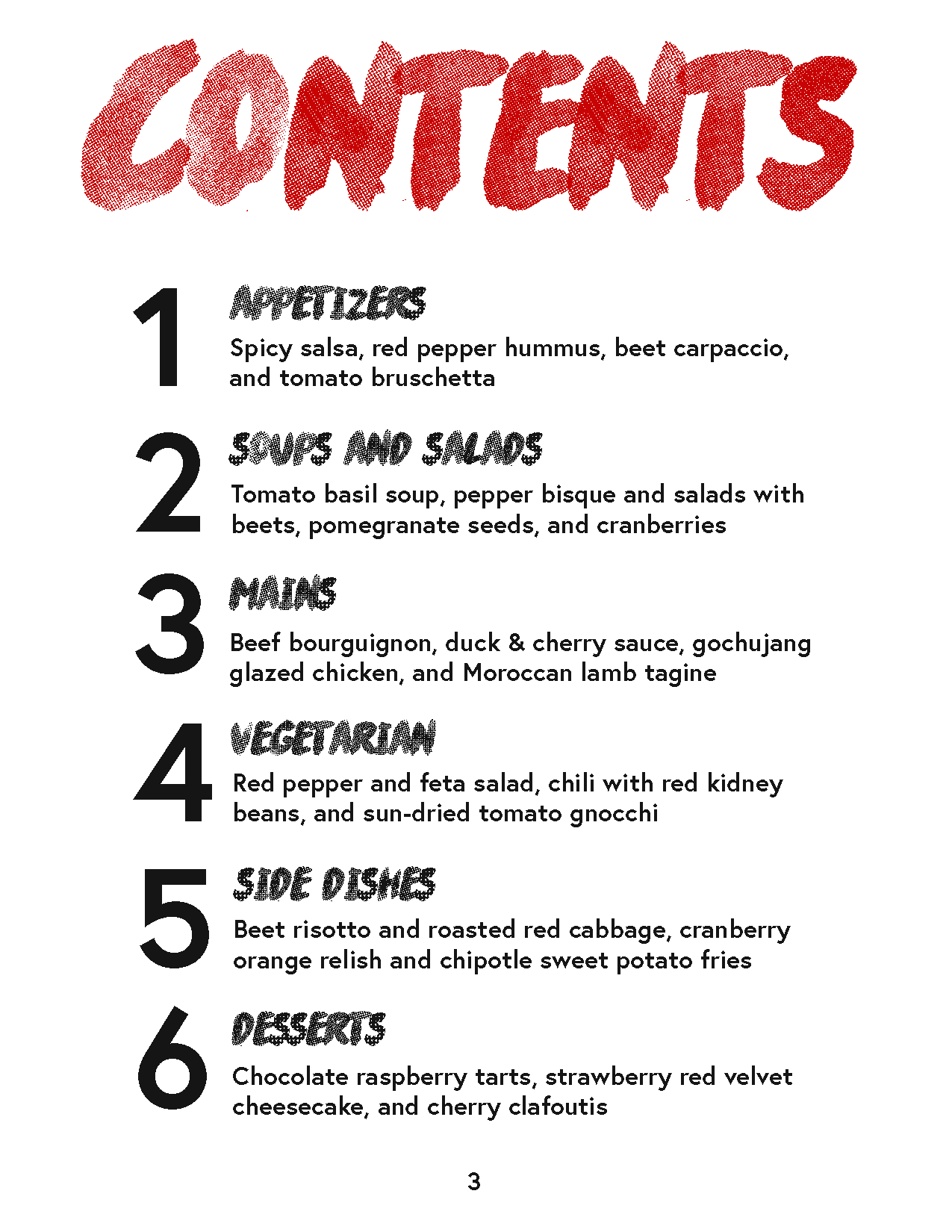
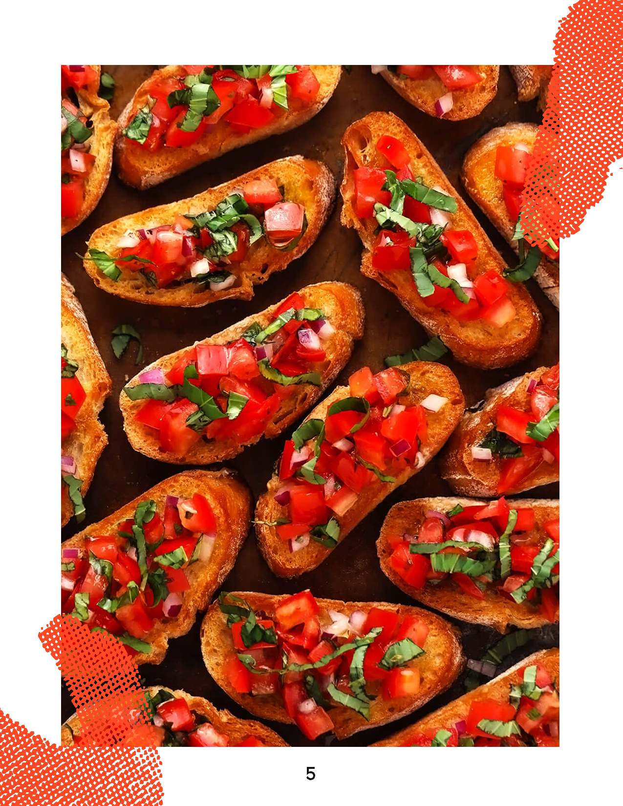
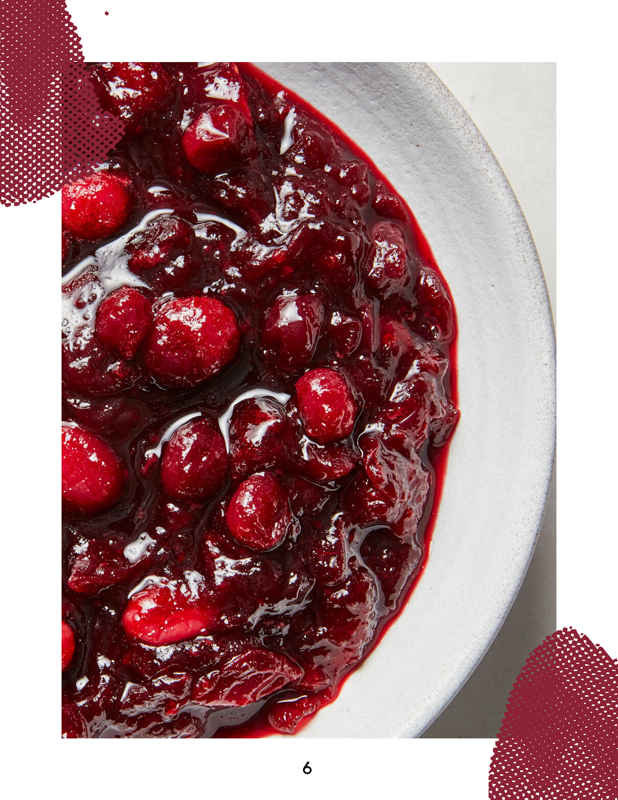
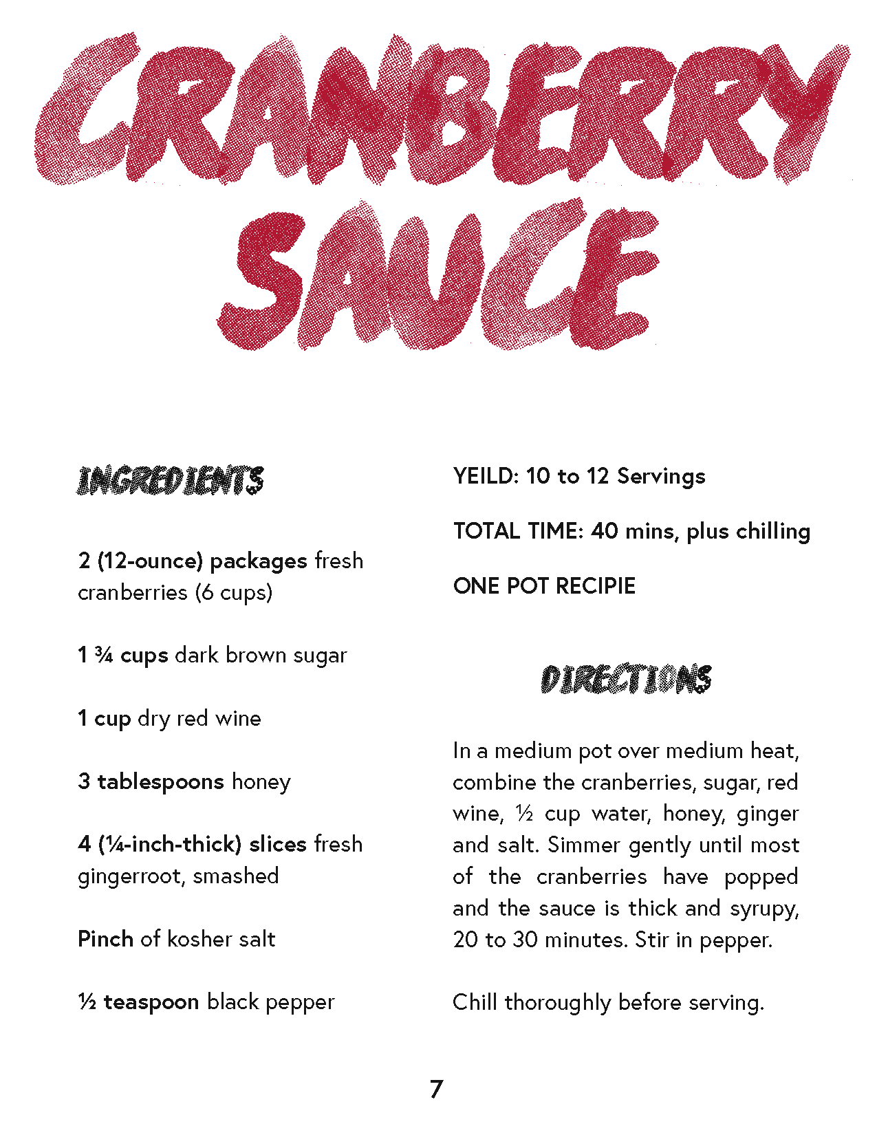
Cookbook categories range from cuisines, ingredients, to celebrity authors, but what about color? I took to Pinterest to find inspiration and was driven largely by imagery. Editorial spreads of monochrome food felt new and exciting. I wanted to contrast the high fashion energy of the photography with a sketchy, fluid typeface. This display font became the design driver. The colorful accents that adorn each interior photo are in fact expanded letterforms of the same type. I loved using the colors within the food to define each recipe spread. I’d buy it.